Making a complex communication platform easier to understand

Overview
Mattermost is not the kind of product you understand at a glance. It is a web-based communication platform built for teams operating in high pressure environments where secure messaging, structured workflows, and fast decision making are critical. The challenge is that its value does not live in static screens. It lives in motion. How alerts come in, how teams respond, how information is shared, and how decisions are made under pressure.
This was not just about designing a clean interface. The goal was to create a web experience that could show how Mattermost works in realistic scenarios, make complex workflows easier to follow without oversimplifying them, and balance product accuracy with a more engaging visual approach. It also needed to communicate not just what the platform does, but why it matters, presenting technical depth in a way that still felt clear, structured, and believable. All of this had to be done without letting the story become too dense, too abstract, or overloaded with information.


A scenario based web experience built around clarity under pressure

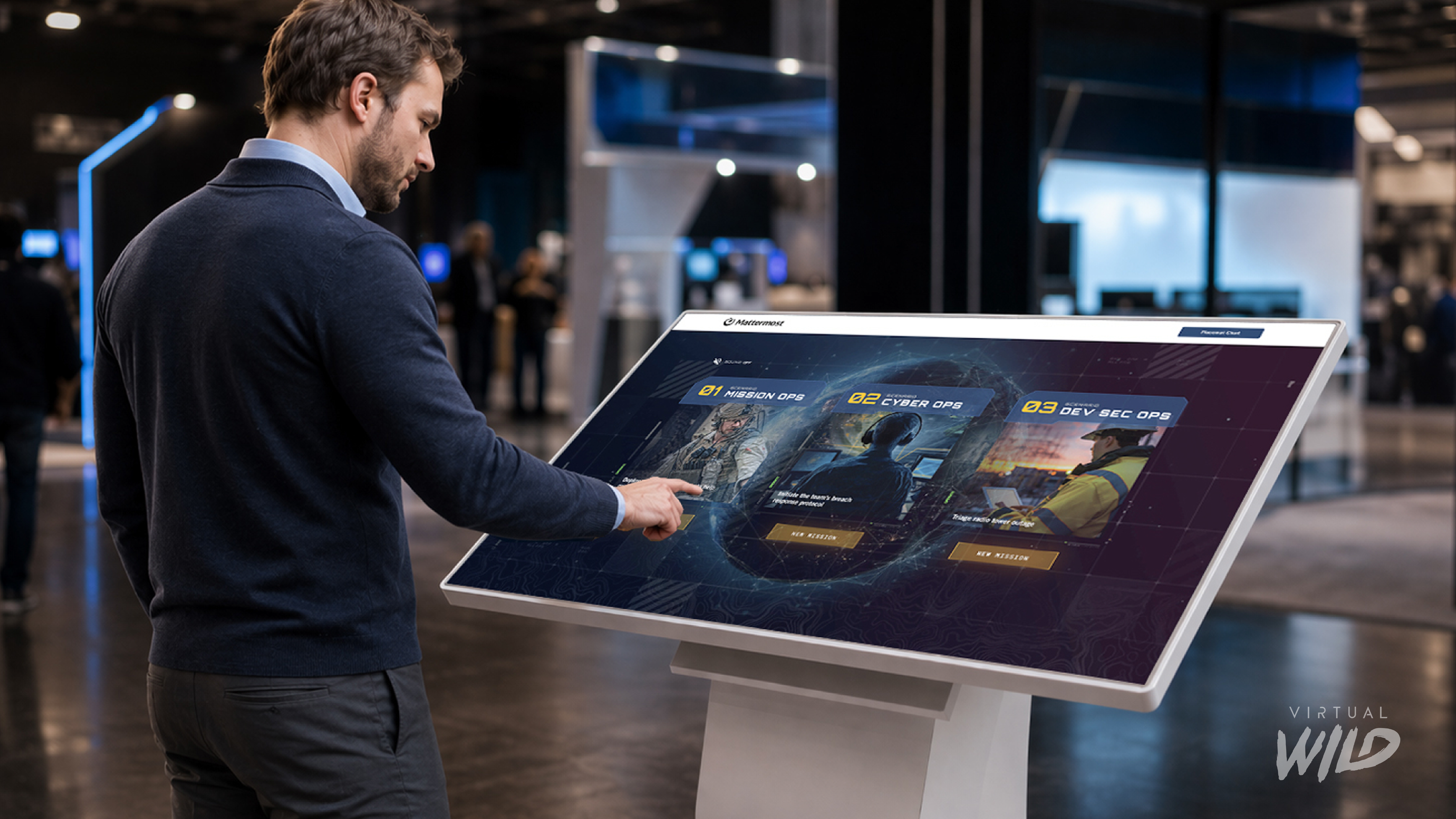
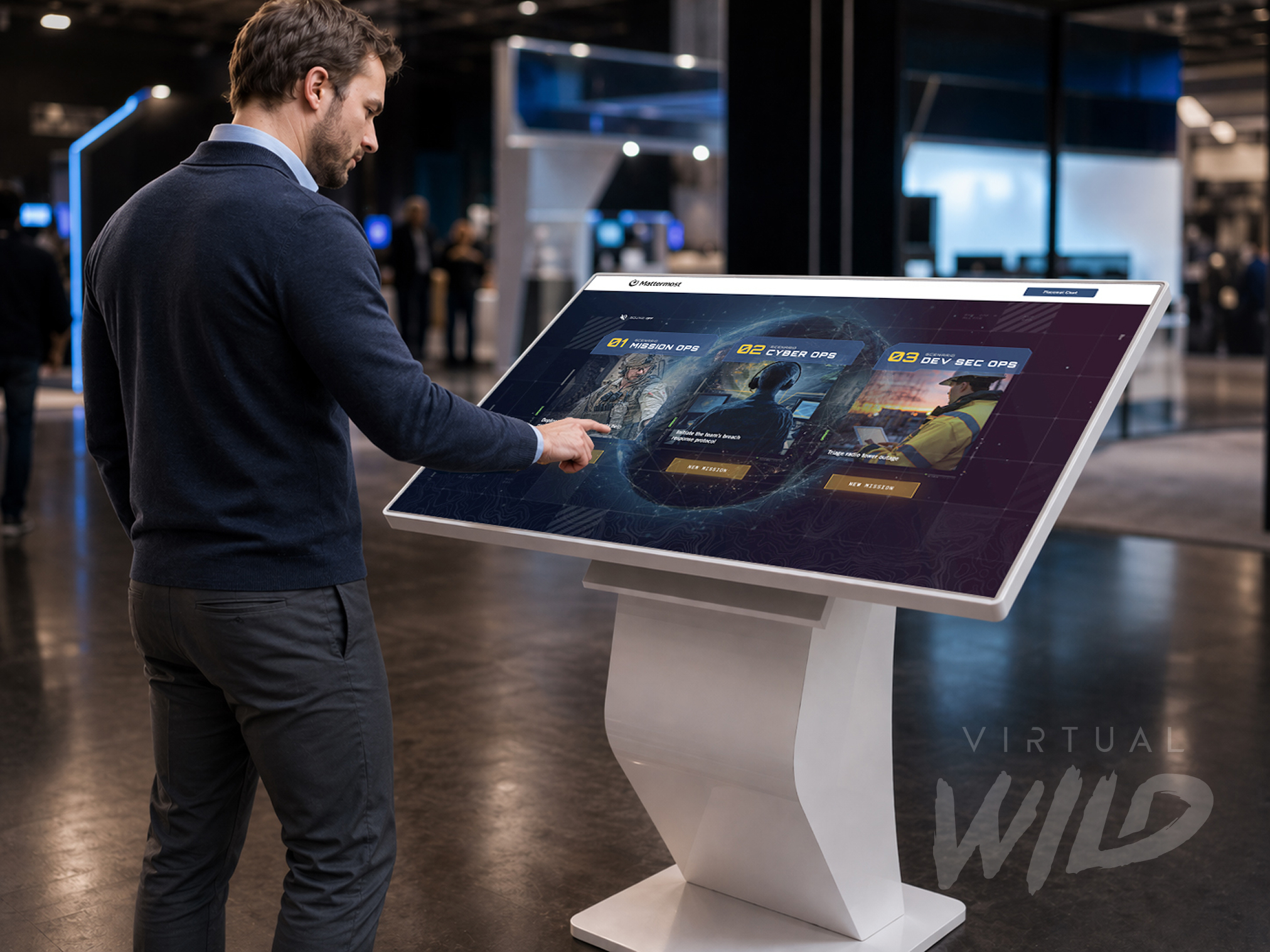
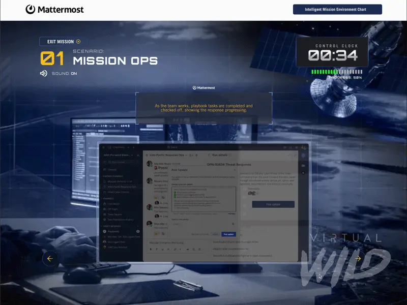
Rather than treating Mattermost like a typical SaaS demo, the experience was designed as a guided story. Instead of relying on feature lists or static screenshots, the platform was framed through real world scenarios that show communication in action. Users move through a structured flow that introduces the environment, presents an incoming issue, shows the team response, and reveals how information is organized as complexity increases. Each moment is designed to reduce confusion and support understanding, creating an experience that feels direct, usable, and grounded.
A core challenge was communicating a system, not just an interface. Mattermost’s value comes from how channels, alerts, and shared information work together in fast moving situations. The experience needed to show how teams stay organized without becoming rigid, how visibility and control can coexist, and how multiple roles operate within one clear environment. To support this, the design uses scenario driven storytelling, strong hierarchy, and structured layouts that separate signal from noise. Subtle interface moments suggest urgency without creating chaos, while a guided sequence keeps the experience intentional from start to finish.
Credibility was also critical. A communication tool built for operational teams cannot feel generic or overly stylized. The visual system was designed to support technical audiences, leadership stakeholders, and first time viewers at once. It avoids cluttered enterprise patterns and unnecessary effects, instead focusing on active layouts, clear hierarchy, and realistic pacing. The tone remains serious, modern, and believable, helping the product feel like a working environment rather than a concept.
The project also required balancing design intent with real constraints. Each screen had to communicate a technical product while maintaining clarity and flow. This meant simplifying without losing meaning, adding depth without slowing the experience, and making careful decisions about what to show versus what to imply. The result is a flexible web experience that works across sales, internal walkthroughs, and product storytelling, turning a complex platform into something easier to understand and easier to use.
A clearer way to communicate what Mattermost actually does

The final experience gave the team a clearer, more focused way to present Mattermost through story, structure, and interface. Instead of relying on scattered screenshots or broad product language, it became easier to show what the platform is, who it is built for, and how teams use it under pressure. It highlights why workflow matters more than a simple feature list and how communication, coordination, and structure come together in one system.
The experience also created a stronger foundation for future use. It supports presentations, product storytelling, and sales conversations with a format that is easier to follow and easier to remember. By turning a complex platform into a guided narrative, it made the product easier to discuss and more effective to communicate.
This shift helped move the conversation from what features exist to how the platform actually supports real work. With clearer hierarchy, realistic scenarios, and a more intentional flow, the team now has a more effective way to explain the product to both external audiences and internal stakeholders. It also sets the stage for future growth through expanded scenarios, deeper product stories, and more refined interactive experiences.
Software like Mattermost is often harder to sell than it should be, not because it lacks value, but because that value is buried in workflows and behaviors that are difficult to explain quickly. This project shows that complex tools do not need to be reduced to generic marketing to be understood. By simplifying the story without losing substance, the experience makes the platform clearer, more useful, and easier to trust. It reinforces that good product design is not just about polished interfaces, but about helping people understand how a system works and why it matters.